SESSION INSIGHT
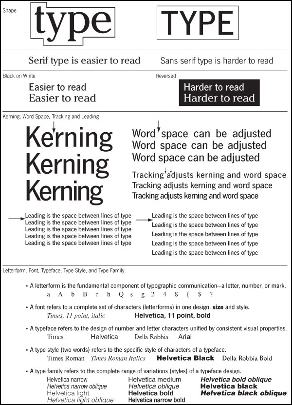
Click to enlarge.
Typography is a very HUGE subject of study, which many young designers don’t fully understand. Many of us think if we know how to spell, that’s most of the work in typography. Nope. Type forms come from deep in our blood as a form of symbol making. So much more than the words can be communicated in subtle, hidden ways from scale, form, color and arrangement.
This not being a class in typography, we won’t be able to teach you all you need to know about the subject in a single session. We can, however, get you started on some very basic principles and techniques that will get you into a more confident space as we push into work that is more text-driven. Stationary type is one thing – but when we are responsible for making it move, that really begins to take on a new challenge. Things to keep in mind are: less is often more; speed and timing is critical; not all type needs to be read, but if you want your audience to actually read and ingest something, make sure it is on screen long enough (the average “directed by George Lucas” title card should be on screen for 2-3 seconds); and finally, keep typefaces to a maximum of 3, but a good working pair is ideal. Click on the image to the left to get a closer look.
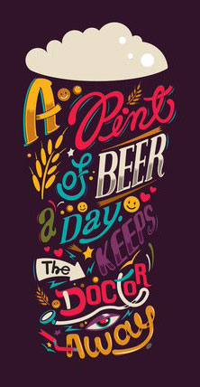 Our tutorials will help with getting your hands on the tools, but I found some very valuable reading for you that you need to look at.
Joshua Johnson over at Design Shack has written up 8 Rules for Creating Effective Typography, and covers some of the language and concepts that a designer must be fluent with.
Read it here
Colin at Photoshop Cafe has published his 10 Principles for Better Type Design, and is a great compliment to what Joshua cover. Please look this over, before and after you start playing with type.
Read it here
And you will learn to love to visit this site more and more. I Love Typography is a great source for knowledge, inspiration and community.
Visit Site
This short film by Robert Leuschke does a great job running the history of type by us in ten minutes. Please watch.
Probably one of the most difficult things for a young designer is working with fonts or typefaces. When we open a computer and jump into a program that allows us to type, we are presented with the operating system’s default fonts – the ones that were loaded by the manufacturer. The program we use might even have it’s own special edition of default fonts in addition to the computer. At this point, we assume that this collection is all we have to work with- it’s pretty varied but half could stand to go into the trash.
So how do we make wise choices when selecting a font for a project, and what are the differences between the various styles of typefaces? There are questions to be asked about the project first: What’s the mood or genre; Is it a masculine or feminine piece; Does the project need to feel big or small; What will the speed of the piece be?, etc. These questions should start to help define the look and feel of the type that would suit the project.
If the pool of typefaces at your hands feels inadequate, do some digging around online for some fresh fonts that are free. Look at sites like www.dafont.com or www.fontface.com (and many others) where you can search by name, category and even with describers like “wild” or “western.” As with anything you download, be safe and smart with virus protection and malware. But those two sites are very solid and dependable. If you are not sure how to install fonts, look it up – it’s super easy and can get a little addictive. Make sure not to overload your system with fonts, as it can really slow your machine down in launch times ans overall performance. Most font libraries and managers have a way for you to organize and categorize your typefaces, and even turn on and off various sets or individual fonts. Try it – as a digital artist/designer, you should know how to do all that. Really.
Here is a great movie to watch about identifying and choosing the right font by Shawn Barry. Please watch:
When playing with type in graphic arrangements, the options are endless: Clean or distressed, open or tight, colorful or monochromatic, etc. The forms that your typographic projects take can be straight forward and clear, or you can play with assembling new forms and create intrigue and a sense of exploration. The thing to keep in mind, though, is that you are using symbols, and it is in our blood memory to feel like we need to identify and decode these symbols. When something presents itself and is too unclear or fast, the audience is usually disappointed or left uninterested. So captivating the eye with the right formula of scale, space, arrangement and speed is critical.
Much of the kinetic type examples you will find on the web follow a hear-see formula, where a clip from a film or maybe a poem is being heard while the artist delivers on-screen the words verbatim, usually with some nice twists and turns and slick transitions into or out of scaled letters. Nothing wrong with this, as it is a fun way to remember a funny or intense moment in a film, or to accentuate the words being expressed. It is in these examples that the artist can get away with excessive speeds and short stage time for words, because the whole experience is being reinforced by the voice over audio.
But if an artist is depending on the visual aspect of the words or letterforms to carry the message or story, care must be given to ensure that the viewer is able to follow along and digest the information with proper timing and arrangement.
 Some type projects need only solid colors as backdrops or maybe some supportive textures. Other times we might see that illustrations or other graphic forms are necessary in order to help tell the story or support the ideas that the text is shooting for. In this case, seeing clouds brings us up into the air, the river silhouette gives home to the words as flowing water. And we finish with the crane and the rising spring waters, with the words delivered in forms of raindrops. We are left with a pleasant journey and an unmistakable message or story.
So as you begin to include type into your works, whether it’s a standalone type project or just an element in something bigger, keep in mind that your viewer is depending on you to think all these things through and deliver a piece that is clear and engaging.
Watch this typographic haiku – the words at times are small and delicate, but care was given to make sure they were slowed down and on screen long enough to be read and processed.
This session is primarily about type, but we will throw a few extras at you as well, in order to keep you ready for your main first project.
Type basics 01
Type basics 02
Follow this link in order to download the necessary files for these tutorial sessions.
