SESSION INSIGHT
de Fournas: From Paper to Screen
When putting anything on screen, including type, it’s a good idea to start with a basic understanding of composition in design. While there are a lot of rules when it comes to composing an image, there are some which are more important.
Watch this video to get a good understanding of the basic principles of composition and layout. While the video deals with still image designs, the exact same principles apply to designs in motion. This will help you not only with typographic compositions but all of your designs in the future.
Here we are going to get a bit more advanced when talking about type. We are going to break down what goes into making a great motion piece featuring type.
One of the most popular styles of type animation is called Kinetic Typography, which is just a fancy way of saying “text in motion”. This style has very noticeable characteristics like big bold letters, often popping on sometimes with subtle animation that lines up with an audio clip.
Let’s take a look at this one and break down the thought process behind it.
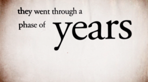 It’s a great piece by David Shiyang Liu animated to a great quote by Ira Glass. The style is pretty simple; he doesn’t have a lot of moving or transitioning backgrounds. Just the text that’s animated which allows us to focus only on it. Too much going on in the background can distract from the focus of the piece, which is the typography.
One of the most obvious treatments of the text is whenever there is an important phrase that is emphasized in the audio, the words are also animated or arranged to reflect that. In this frame from the video, notice the size difference in the words. There is more emphasis on the larger word which makes it seem more important. In the audio, Ira stresses this word when he’s talking so it makes sense that the visuals should also show how important the word is.
Also notice how he uses good composition to keep the different sized words aligned with other parts of the text. The word “Years” is aligned with the word “through” and the second line of text is aligned to the top of “Years” as well.
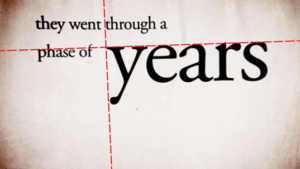 You see this a lot in type, that the text is almost always aligned with something else on screen even if things seem disorganized or careless, good design always has some kind of order.
There are also moments in this piece where the words are animated in a way that reflects what is being said. Take a look at this frame too.And notice how the word “gap” has a literal gap in the line of text before it. It’s just a perfect example of when you can use the word to add subtle animation to your typography so that it plays along; it really helps to polish the piece.
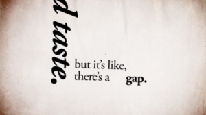 Also notice how this piece only uses 1 font and about 2 or 3 styles of that font (Regular, Italic, Bold). You shouldn’t go over 2 or 3 fonts or font variations to keep your audience grounded to the piece. So when in doubt just remember KISS: Keep It Super Simple!
Here is another great example of Typography in motion by Thibault de Fournas that is both beautiful and informative.
As you watch it, try to notice how the type is composed and how certain words are animated to mimic what’s being said. For example, if the word is “disappear,” the text might fade away. Or if the word is “shake,” the text might have a little wiggle to it. It’s this attention to detail that really make the great pieces stand out.
If you need more inspiration, here’s a nice collection of typographic animation examples.
After watching these great works of typographic art, it’s easy to feel discouraged if yours isn’t as good (I know I get jealous) but just remember that every single great artist had to learn their craft just like you. Keep creating work and you will get better and better.
Now we already know we can move and animate text just like any other layer in After Effects but text layers also have a whole other world of possible animation. These are called Text Animators and they allow us to manipulate letters, words or even whole lines of text in interesting ways.
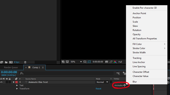 To get access to this menu of text animation you must first use the type tool and create some text, you will now have a text layer. If you twirl down the properties, you’ll notice next to the word “Text” is an option called “Animate” with a triangle next to it. Click on that triangle and you will see a whole menu of things you can animate: Postion, Scale, rotation, Opacity, etc. Animating this way allows us to manipulate more than just the layer itself but each letter or word in that layer.
Watch this short video to get a brief introduction to Text Animators and some simple effects you can achieve with it.
More advanced animation of type:
Understanding Type Animators:
30DAE Day 26: Understanding Type Animators in After Effects from School of Motion on Vimeo.
There are no necessary resources for this session’s materials.