Today’s world of digital compositing comes from a pretty long history of analog processes and techniques where the ultimate goal has been to combine two or more images or visual elements into a new final creation. Much of the early forms were a product of the desire for creating magic tricks for the audience. Today the term compositing covers an extremely wide variety of results and applications.
The goal for this session is to understand the ideas behind compositing and feel confident in blending graphics and video for relatively basic composites, but to also get the artist comfortable to a point to take it further in their own pursuit.
SESSION INSIGHT
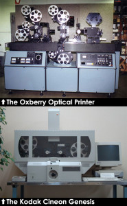 Compositing got its start in the late 1800’s with George Melies and his use of painting black mattes on glass then using a double-exposure process in-camera to achieve his visual magic tricks. It’s gone through many changes of techniques and products along the way, but the most consistent element to the analog compositing process has been the optical printer. This is a piece of equipment that involves at least two projectors that are tied in to a film camera. This has been the hero in special effects (think of tie fighters chasing the Millennium Falcon…), preservation and restoration of films in the motion picture world. The optical printer was created in the 1920’s and was a powerhouse in the film world through the 1990’s, as it began to see itself phased out by new digital solutions. Today, it is mostly used by experimental artists, museums for education and for making copies of older films. Check out this short film, Twilight Cameraman for some insight into this monumental machine.
Digital compositing got its start with Kodak’s Cineon System. This was a really complex film scanner that would capture each frame of a film and send it to a proprietary machine/hardware that would be used with Kodak’s Cineon Digital Film Workstation software. You could not buy this software and put it on your Mac or PC – it was a a huge station that really only lived in Hollywood post production studios. This system is truly responsible for the digital revolution that was to come.
Since then, the world of digital compositing has seen a lot of action – much of which was still not available to the consumer or prosumer market. Discreet Logic create Flame in 1991, the first software-based visual effects product that could run exclusively on the Silicon Graphics platform. This soon led to the addition of Flint and Inferno, two more heavy hitters in the motion graphics and visual effects post-production world. Then Smoke and Flare, then to the acquisition by Autodesk (now known for it’s 3D software, MAYA.)
Eventually this led us to Adobe’s answer to the equation in 1995, one that became available to all end-users at a platform-friendly product: After Effects. And it would be remiss to not mention other popular compositors like Apple’s Shake, Blender, Fusion and Nuke.
 So much of what you’ve learned and applied so far finally gets to come together in a marriage of video and graphic. This will be a time where we mostly focus on lower thirds, but will be a leaping point for other applications such as station bugs and title sequences. Lower thirds are graphic elements used on screen over video in order to display information without the noise/texture/movement getting in the way of visual interpretation and text consumption. Surely, there may be times when it’s simplest, fastest and cheapest to just slap text up on the shot, but it really is worth the incorporation of color, form and supportive flare when going the extra mile to make a nice lower third graphic. The important things to keep in mind when working with graphics on video are color palette, scale, placement, movement and opacity (to name a few.)
If creating a package for a production that will include overlaying graphics, you should take ample time to develop a color palette that can be applied throughout the assets. This could be pulled from a logo or branding campaign of a company that may be the subject of the film/video, or inspired by the subject/content (nature, cultural elements, tech, etc.)
With scale, keep in mind the material that your graphic will be covering. A lower third usually happens when there is a person on screen, more often a close-up. It would be ideal if the footage you are working with was shot well enough with graphics in mind during production – something a good cameraman will be considering while filming. So then our responsibility is to make sure our graphics don’t get in the way of the shot. Large, clunky designs just don’t work usually, as they might cut off part of the speakers face.
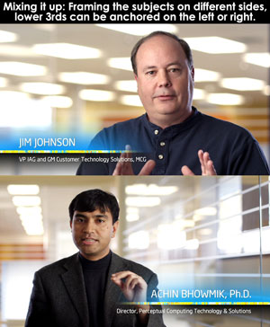 Most lower third designs take place at the bottom of the screen, anchored off the left side, but this doesn’t have to be the case all the time. There is definitely something to be said about following tradition, as it makes it easier for the viewer to not have to adjust to a new format. But it all really depends on the tone and mission of the piece, as well as the audience. A project targeting a younger and energetic audience could very well break some rules.
Movement is something to take seriously when designing a good lower third. How the elements come on to screen , hold and exit is really a fun part of the deign, and can bring a little more interest to a really stiff/boring subject. As with any kinetic graphic, the art of making delivery fluid if not nearly unnoticed is surely one to master. Any time something awkwardly pops on or off can be jarring for the viewer and look unprofessional. Make it easy, flowing, clean and with finesse.
With opacity and blending modes, we can deliver critical information and still let the video/film stand strong behind it, be it a talking head or action shot. You should also be thinking about edges of your graphics. Are you using geometric elements (rectangles, etc.) that slide out or unfold somehow? Should they gradually dissolve into the background footage, or should they be strong hard edges? Do the elements have blending modes that allow them to integrate more, or are the solid and opaque? These are the questions you should be asking yourself as you begin to design.
And of course, you need to provide contrast so your text can stand out without strain. That is why we are creating these things, anyway. Nothing more annoying than not being able to read text on a screen.
This short video helps us understand a bit more on this topic:
I appreciate how this artist demonstrates Reference Size, but you need to think about applying that technique to the real objects that you are referencing, not by using an image in your program… that is kind of cheating at this point in the game. Try doing the reference technique with the items you have collected to draw. Watch out, there’s a really loud guitar intro on this one…
Composited graphics be flat, stationary and lifeless, or they can be complex, layered, moving pieces of art. Hopefully we strive for striking work more than we do mediocrity. So what can you do to push your pieces, especially traditional elements like lower thirds? Think about light and shimmer, subtle movement, blurs, integrated animated components… These little touches can really impress a client, and also make for a pleasant experience for the viewer.
Organic forms like light flares, ink blots and even video textures such as clouds or water can be really fun to incorporate in your work. Think past the quick and easy, put a little extra energy into your design, and it will pay off. Have a look at some examples below to get some inspiration.
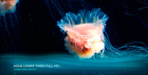

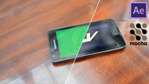 Other forms of creative compositing with video assets can be pretty fun to explore. We see it all the time in commercials, music videos and even major motion pictures, but sometimes it even comes in handy for mock-up proposals that only a few people might see. When working on tasks like screen replacements or real-world video inserts (secondary video popped into a window in the background of a shot, swapping out footage on a TV set in a scene, etc.) it’s important to keep in mind the critical factors of matching light, color, resolution, blur, edges and so on. We have the power to to make magic, but if we slack on the details, the trick is spoiled.
The materials we will explore in the tutorials will be with stationary shots, but if you are motivated, look into the process of tracking cameras and advanced screen replacements. You will be really surprised and inspired by how easy the process has become in the software at our fingertips.
This short video helps us see a more contemporary result of digital compositing:
